Procter Fencing Systems launches responsive website
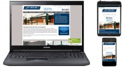 Procter Fencing Systems has redeveloped its website so that it is now responsive, presenting users with the optimum layout for a PC, tablet, smartphone or phablet. |
Procter Fencing Systems has redeveloped its website to make it responsive, which will benefit visitors using tablet computers, smartphones and phablets. The layout and navigation for desktop and laptop computers remains largely unchanged, but people browsing on mobile devices will experience a website that is formatted to suit the screen size, orientation, aspect ratio and resolution. Where appropriate, the navigation is also altered to suit the device.
The responsive website will be of benefit to architects, specifiers and contractors, particularly those on site, whether they are searching for fencing or gates, or meeting with clients. It will also be more convenient for people in an office or home environment who happen to be using a mobile device rather than a desktop or laptop computer.
As with the previous website, the content includes a wealth of detailed information about high-quality standard and bespoke fencing, security fencing, railings and handrails, timber fencing, gates and barriers. The website also includes information about Procter Fencing Systems’ accreditations and services such as free site surveys and quotations, design, manufacture and installation. In addition there is a library of guides for architects and specifiers, a photographic gallery, case study datasheets, CAD files, news, FAQs and background information about Procter Fencing Systems.
Follow the link to explore the new website at www.fencing-systems.co.uk or contact Procter Fencing Systems to discuss specific projects by means of the Live Chat facility on the new website.